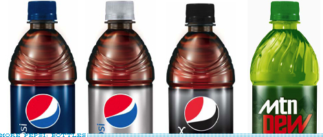
On Pepsi's New Branding....
I can see why so many people dislike the new Pepsi logo. Yes, I too
quivered when I first saw it. Yup they are famous for constantly
changing their branding and all that but a lot of the argument I think
needs to go deeper. Pepsico knew this backlash would happen. They knew the new design would not bode well with a wide swath of their drinkers but the “what” is not the question, it’s the why.
After taking a long hard look at the logo my guess for why they did it is this.
Yes there will be heavy online buzz (including this post) but this logo was not designed for the NOW,
it was designed for the future. Current context is not it’s focus. This
logo was designed for a future zeitgeist. A theme, a style, a mode of
thinking…not yet popular. When a company of the size of Pepsico
redesigns their branding as often as they do, they have come up with a
design that is projected from their future to the now. it cannot be
defined by not current tastes.
They do this not just for design longevity’s sake, but also
packaging purposes. If this new branding is to carry them through the
next 10, 15 or 20 years it allows them to project packaging costs much
better. For a company the size of Pepsico these projections can make or break their bottom line.
Think about it.
If they design a logo that is more concurrent with today’s
design language or thinking and it gets stale in 3 - 5 years, that is
going to be millions of dollars lost for the company’s that
produce their packaging, and in turn Pepsico, because it will represent
a massive retooling for these guys because of the sheer volume of
printing and production that goes into the packaging process. So for
me, that is the why. The design will slowly grow on us and it will soon
seem ahead of it’s time….. no I take that back. That’s probably what
the Pepsico board is betting on.
